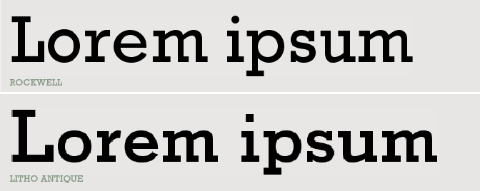
Rockwell was designed in 1934 by The Monotype Corporation but overseen by Frank Hinman Pierpont. In 1894 Frank Hitman Pierpont was a trained mechanic who worked in Berlin for Loewe AG, who were manufacturers of a typesetting machine. He later moved to England and became foundry manager at Monotype Corporation. Rockwell is based on an earlier typeface made in 1910 by the Inland type foundry which was known as Litho Antique, American Type Founders revived the typeface in the 1920s, with Morris Fuller Benton. This was a more condensed font than Rockwell as we know it to this day.
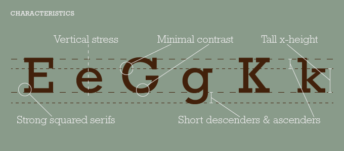
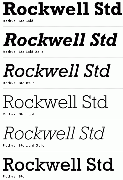
Rockwell is a Slab Serif typeface, this means that the serifs are thick and bold. The serifs are equal to the stroke width of the typeface, although on Rockwell bold there is a slight contrast between the stroke width making the vertical width slightly larger. It also has a geometric construction for example the upper case ‘O’ and the lower case ‘o’ are almost circular with a vertical stress. Some qualities of the font that are very distinctive is the bar at the apex the ‘A’, the deep serifs on the ’T’ and the ‘L’ creates a linear over all look, the wave tail at the bottom and outside of the ‘Q’. The tall x heigh and the short ascender and descenders makes the font stand out well as it looks like a strong font. Rockwell is available in four different weights. Originally the font was designed for metal machine printed type. But it became so popular it was later digitalised although the shadowed weight has not been.
Rockwell is a simple yet striking typeface, it can be a good font for a display face for headlines, posters and short text, although would not work well for a long piece of text as it is quite a heavy font. It was used a-lot in publishing, packaging, and art/editorial design in the late 1950s and early 1960s. Rockwell has been used for Malibu Rum’s brand type face and posters & magazine advertising for the fashion magazine Vogue. There are also playing cards designed by Gloria Wu which on each card highlights a letterform or symbol of the typeface Rockwell in both positive and negative space.